SwiftUI TextField - Basics and Common Modifiers

One of the essential components of any user interface is the text input field. In SwiftUI, this is handled by the TextField view. In this article, I will cover the basics of how to use TextField and introduce some common modifiers used with it. More advanced topics, such as managing focus states and validating user input, will be covered in the next article. Whether you’re new to SwiftUI or looking to deepen your understanding, this guide will provide the knowledge and practical examples you need to effectively use TextField in your projects.
*Code is tested in Xcode Version 15.4 (15F31d)
Basic Usage
The most basic form of TextField creates an empty text field with a placeholder in it.
struct ContentView: View {
    @State var username = ""
    var body: some View {
        VStack {
            TextField("Username: ", text: $username)
                .textFieldStyle(.roundedBorder)
        }
        .padding()
    }
}
The code above gives us output like this:

There is a version where you can provide a prompt to the text field. The prompt will be shown as a placeholder, and the title will not be shown in iOS. The appearance is no different from the previous one. However, if it is enclosed within Form tags and used in macOS, it will be shown as a placeholder in the field along with the title. The prompt argument receives Text type, so this comes in handy when you want to customize the appearance of the placeholder text.
Form {
    TextField("Username:", text: $username, prompt: Text("Enter your name here..."))
}
The result of the code above is rendered as:
Auto-Growing Textfield
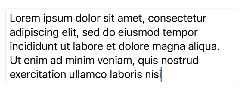
The default TextField accepts one line of text, and if your input exceeds the screen, it will just continue to grow the text in the same line. TextField provides an easy way to grow the text field vertically if the text is not going to fit in the space.
TextField("Username:", text: $username, axis: .vertical)
                .textFieldStyle(.roundedBorder)
This gives us the result like this:

Use It with Number
In the previous examples, we dealt with text, but TextField can also be used with numbers.
struct ContentView: View {
    @State var salary = 50000
    @State var percentage = 3.175
    var body: some View {
        VStack {
            TextField("Numbers", value: $salary, format: .number)
                .textFieldStyle(.roundedBorder)
            TextField("Percentage",
                      value: $percentage,
                      format: .number.precision(.fractionLength(2)))
                .textFieldStyle(.roundedBorder)
        }
        .padding()
    }
}
Common Modifiers
keyboardType(_:): Used when you want to present a specific kind of keyboard.
TextField("Enter your income", text: $income)
	.keyboardType(.decimalPad)
textContentType(_:): Provides hints to the system for autofill and other features.
TextField("Enter your email", text: $email)
	.textContentType(.emailAddress)
textInputAutocapitalization(_:): Controls the autocapitalization behavior. autocorrectionDisabled() disables autocorrection.
TextField("Shop Name", text: $shopName)
	.textFieldStyle(.roundedBorder)
	.textInputAutocapitalization(.never)
	.autocorrectionDisabled()
Styling with Custom TextStyle
You’ve already seen the default TextFieldStyle that SwiftUI provides in the previous examples. You can create your own custom TextFieldStyle by defining a struct that conforms to the TextFieldStyle protocol. Here is an example that adds a rounded corner with a gray background and a little bit of padding.
struct RoundedGrayInputViewModifier: TextFieldStyle {
    func _body(configuration: TextField<Self._Label>) -> some View {
        configuration
            .padding()
            .background(.gray.opacity(0.5))
            .clipShape(RoundedRectangle(cornerRadius: 12))
    }
}

struct ContentView: View {
    @State var username = ""
    var body: some View {
        VStack {
            TextField("Username:",
                      text: $username,
                      prompt: Text("Username: ").foregroundStyle(.white))
                .textFieldStyle(RoundedGrayInputViewModifier())
        }
        .padding()
    }
}
The example gives us something like this:

Alright, that’s all for the basics of using TextField in SwiftUI. We covered how to create and customize text fields with various modifiers. In the next article, I’ll dive into controlling the focus state and validating user input. Thanks for reading.


